How the BBC designed an accessible typeface
Sarah Botterill | 08 Mar 2021What’s in a font? Anyone who has agonised over the specific font collection to create their CV doesn’t need persuading on the perceived impact it can have.
But there’s more to a font than that, as the BBC discovered when it decided to create a bespoke font that would work for the digital age, in multiple languages and be accessible for all.
David Bailey, UX Principal at the BBC, explains the genesis of the project.
“A key element of a design language or a brand is the font or typeface. We [the BBC] were using Helvetica or Arial. We also had Gill Sans as the corporate typeface. These typefaces were designed a hundred years ago for the printed page,” he said.
Bailey added: “These fonts don't perform well on today's modern digital screens, and there was a real opportunity to push for a better visual typographic tone of voice.”
Accessibility was another key driver for change, says Bailey.
“Apple launched the first iPhone, and that saw this exponential growth in the consumption of the written word and articles on very small screens which raises all sorts of issues around legibility and performance of typeface from a reading point of view, which we were dealing with at the BBC.”
Why choose a bespoke typeface?
 The BBC decided to create a bespoke typeface. This created a unique opportunity to fix legibility issues and would save the corporation money.
“If we owned our own typeface, then there'd be some upfront costs, but we'd see a return on investment very quickly by retiring all of these font licenses,” said Bailey.
The journey began by convincing internal stakeholders of the value of the project.
“I did a lot of traipsing around the organization and talking to people and getting stakeholder buy-in because introducing a typeface is a huge undertaking at the BBC. But eventually, it did get up to the executive board and was approved, and there was almost a response of, well, why on earth aren't you doing this already?” Bailey said.
How to build an accessible typeface: starting out
 The BBC put out a call to British typeface design studios. It picked Dalton Maag, which designed fonts for the Amazon Kindle and the Rio Olympic Games and others.
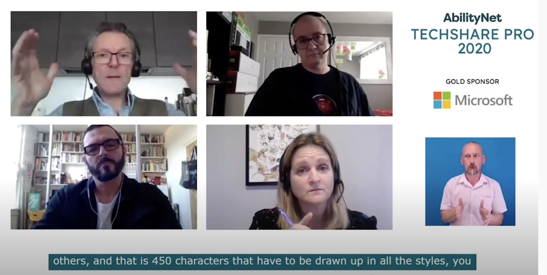
Founder and chairman Dalton Maag joined the TechShare Pro session to explain some of the challenges and how these were met.
“There is an important distinction between need and want,” he said.
Maag continued: “With the BBC being a public company, it needed to be accessible to everyone from five years old to 85 years old. And that brings very specific requirements to a typeface and typography.”
A key discussion, therefore, was what is an accessible font. “We always work on the premise that there are three parts to accessibility: emotional accessibility, how you feel about things; functional accessibility, how this works in terms of a human perspective and legibility and readability,” explained Maag.
For the BBC, an added element was to be legible in multiple languages.
“The reality is that most typefaces do not support anything beyond Western European or even Eastern European languages,” said Maag.
How to build an accessible typeface: process
Once a brief was agreed upon, the process of designing the bespoke font began. The process starts with a handful of characters to establish the basic alphabet and establish a direction.
“You don't do that on the entire alphabet because that will be far too labour intensive. We presented about 10 different variants of the typeface, 10 different interpretations of the brief. From those, the BBC chose two design directions,” said Maag.
The next step was to expand that design into capital and lowercase letters and use it in dummy copy across various devices.
How a font's design identity can impact accessibility
The next step was testing the font for accessibility in different environments and across different devices.
“You really need to take the human being into account. You need to understand that. For example, if you are a 60-year-old person, your visual acuity is only about 20% of [that, of a 20-year-old,” said Maag.
He explained: “That means with the implementation of a typeface on a mobile device, the letters have to be strong enough so as not to completely disappear because as an older person, I can't actually physically see it because my eyes do not have enough receptors to find enough resolution to make out all the lines and all the parts of the character.”
Neuroscience and font readability
 Just as important as appearance was the font’s accessibility for people with learning disabilities. Underpinning, this is an understanding of the brain's neuroscience and how we read and understand information, as Maag explained.
“Once that visual input comes into the eye and is converted into electrical impulses, it then travels along the optic nerve to the back of your brain where your visual cortex sits, where basically all imagery is being collected.”
Maag added, “The visual cortex distributes that image into different parts of the brain for various activities, such as facial recognition, object recognition, and visual word form area, which is basically the decoding and the recognition of any writing.”
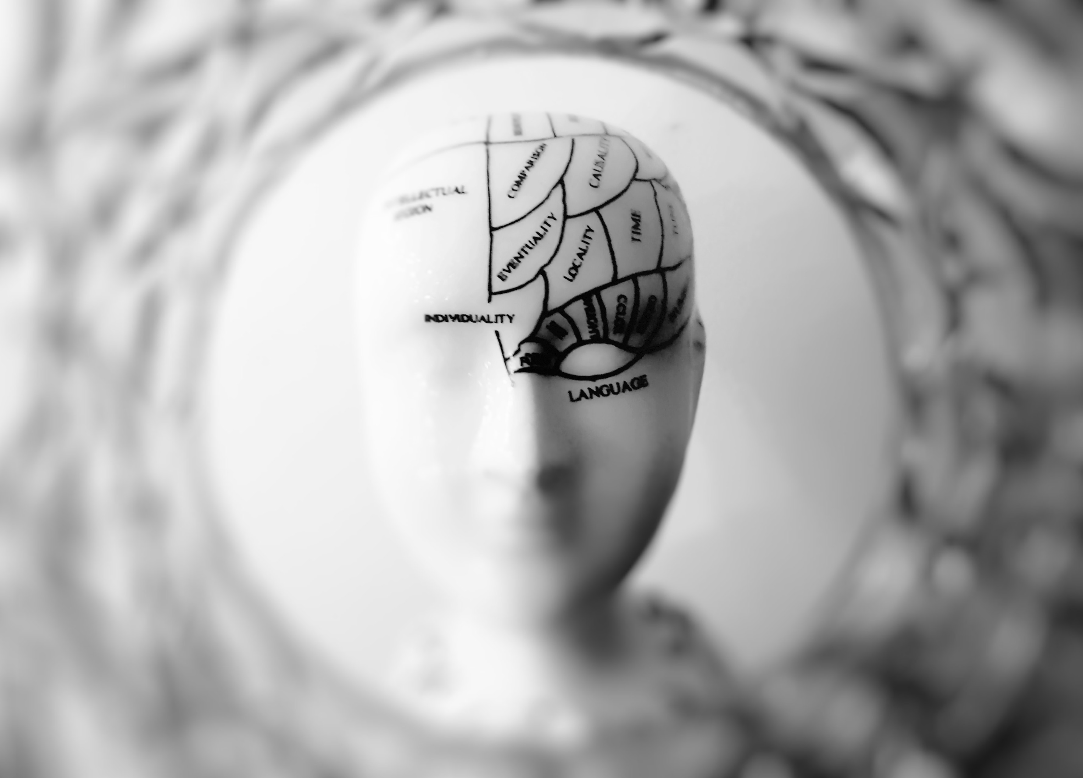
The brain's area responsible for this visual word form area is a tiny part of the brain that sits in the brain’s left hemisphere behind the ear. The size of a fingertip, this area decodes letters and pairs and turns them into word shapes.
Word shapes are, in turn, sent to the front of the brain and create meaning.
Font design and learning difficulties
Learning difficulties such as dyslexia says Maag, derive not from a visual deficiency but from “a phonological deficiency”.
“To use a very crude example, if your brain cannot successfully distinguish between the sound B and P, then your brain has no chance to correctly map the sound B to the shape B or P to the shape P, which then means when you have a word shape the semantic area cannot successfully detect what the meaning is of the word,” he said.
Difficulties can be more pronounced among English speakers. “English is an opaque language where basically nothing spells how it is, how it sounds,” claims Maag.
Only when the font was tested from in a number of technical environments for functionality did Maag and the BBC explore its use across multiple languages.
Accessibility across multiple languages
 Adapting the font for multiple languages was a further challenge.
“The full character set in the Latin environment will usually contain about 350 characters. You add Cyrillic for the languages spoken of the former Soviet Union [and] you're looking at another 120 characters,” said Maag.
“You have about 500, 550 characters in that font that have to be drawn up.
Also, you should consider styles: light to regular, to bold, to extra bold, condensed and italic characters to build a full library of fonts.
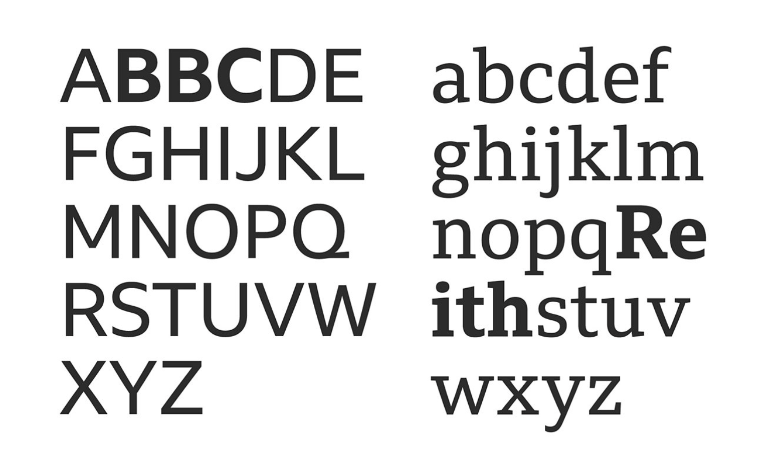
In addition, the BBC created a Serif and a Sans Serif font.
Learning what we don’t know
The process of designing the font has been a learning experience for all involved. Gareth Ford Williams, the BBC’s Head of UX Design says they were able to look beyond anecdotes and to research what accessible fonts actually look like.
“There's a lot of anecdotes around accessibility fonts, and there's a lot of things that, that say, ‘Hey, we're a magic bullet font. And when you start digging into it, it's very surface research,” he said.
“We've learned an enormous amount and been able to achieve a lot.”
Working together the BBC and Maag took care to test with dyslexia and vision impairment.
“We tested with mixed-ability user groups of different ages, different reading abilities. In different contexts, whether we were looking at different screen sizes, we were testing in for subtitles and subtitled display. We were looking at tickers and moving graphics, as well as screen graphics and the contexts, were incredibly wide. And so, we were looking for problematic areas for performance,” said Ford Williams.
The longer you are exposed to a font, the more used to it you become, and this was factored into the testing; the new font was benchmarked against incumbent fonts.
“When we ended up going through, through the actual testing itself, it outperformed.”
The BBC’s new accessible font is called Reith.
Professional accessibility services from AbilityNet
Discover more about AbilityNet's accessibility products and services.
- Find out how we can help train you and your staff on accessibility or download our training catalogue.
- For details of FREE webinars and interviews go to AbilityNet Live!.
- Download our brochure to find out how we can help you on your accessibility journey


