Rio 2016 Paralympics website: Gold medal lessons on accessibility
Joe Chidzik | 16 Sep 2016![]() Over the past couple of weeks, we've been monitoring the Rio 2016 Paralympics site closely. At the start of the competition, we briefly highlighted some of the accessibility issues of the Paralympics site. Now we've dug a little deeper and can provide some examples of issues which need to be resolved in the hope that lessons will be learned for the future.
Over the past couple of weeks, we've been monitoring the Rio 2016 Paralympics site closely. At the start of the competition, we briefly highlighted some of the accessibility issues of the Paralympics site. Now we've dug a little deeper and can provide some examples of issues which need to be resolved in the hope that lessons will be learned for the future.
The main points the site fails on are:
- inconsistent skip to content navigation
- focus indicator is required
- don't assume understanding
- tag graphics clearly.
Inconsistent Skip Navigation
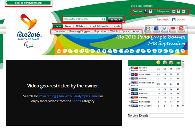
The Paralympics 2016 website has a 'skip to content' option on some pages but not on others. The skip option, which is simple to instate, is used primarily by people who have a physical disability that makes mouse use painful or impossible. This could be ULD (upper limb disorder/ RSI) or Parkinson's. Such users instead mainly use a keyboard and tabs.
Users with profound physical disabilities rely on switch input - these are one or two physical switches (buttons/ voice commands/ movements or other) which allow the user to step through the page in a linear way, interacting with any content of interest. Without skip navigation, the method of interaction can be very time consuming as users need to step through all content in a linear fashion.
In order to access the video on the Paralympics 2016 home page, a mouse user would click just once. But because the page has no skip content option, the keyboard or switch user would have to tab 30 times to navigate to the video. In the following image, we've highlighted all of the content that a keyboard/ switch user would have to tab though.
A focus indicator is essential
When navigating a page using a keyboard/ switch it is essential for users to be able to follow their own progress as they tab through content. As they tab onto links, or buttons, an outline shows them which link\button is selected.
This works well on navigation menus on the Paralympics 2016 site. However, on the schedule and results page, tabbing through the results table is not possible for keyboard/ switch users as there is nothing to show which link is selected. This is as simple to fix as one line of CSS (the language which governs how web pages look) eg simply adding the CSS command 'a:focus' to an existing 'a:hover' declaration would resolve this problem for sighted keyboard users.
Don't assume understanding
On the login form and registration page, there are a number of issues. Firstly, an asterisk is used to indicate required fields, however there is no instruction telling users that this is so – some users may not be aware of the meaning of the asterisk.
In addition, there are no error messages at all on these pages. Instead, when registering with missing or incorrect information, input fields are highlighted in red (see image below). This is particularly problematic for users with learning difficulties, but will ultimately affect all users. Without error messages, users will find it difficult to know why they could not submit the form. This fails multiple accessibility checkpoints, but is not challenging to fix.
Developers need to make sure they:
- Clearly identify errors to all users (including screenreader users)
- Describe the error in plain text (eg, which field had the error)
- Describe how to fix the error (eg, the username field cannot contain any punctuation)
Tag graphics clearly
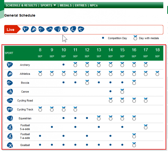
The table above uses graphic icons to represent competition days/ days with medals. Visually, the table is very useful - a sighted user can easily hover over certain areas of the chart to clearly and quickly see dates and event. However reading through the table using the screenreader JAWS, the highlighted table cell for 9 September is announced as '9th Sept. Link graphic. Nav/medal-indicator. Athletics Fri. 9th Sept. Link graphic. Nav/medal-indicator. Column 4'. This is not very helpful! Friday is also abbreviated to 'Fri'.
It would only take seconds and to make these descriptions more useful. Check out our expert accessibility review of the Rio 2016 Olympics website.