
Creating Accessible Documents
This factsheet presents some helpful tips on improving the accessibility of your publications, for both print and reading online.
It focuses primarily on producing accessible material using Microsoft Word – but the principles involved are universal and may easily be applied using other software.
Last updated: May 2023
Contents include
1. Key principles to follow
To be truly accessible, it is not enough for a document just to look well-presented. For it to be read and understood by as wide an audience as possible – including, for example, people with visual impairments, dyslexia or learning difficulties – your document also has to work well with screen reading software.
It is good practice to write as though for electronic publishing – based on the following main principles:
- use a proper ‘headings’ structure
- write in short, simple sentences
- write in plain language and avoid jargon and abbreviations
- use a common, plain font and a text size of at least 12 point
- use proper list formatting for numbered or bullet lists
- provide a meaningful description of important images
- check the accessibility of your document using Word’s built-in checker.
This document has been produced using all of these key principles.
2. Use proper headings
You should use an appropriate heading structure for your document. This means using a hierarchy of headings – such as Heading 1, Heading 2, Heading 3 etc. This enables screen readers to identify headings for the listener, and also allows navigation of the document by its headings.
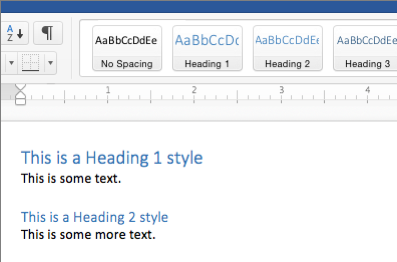
In Word, headings are set using ‘styles’. After highlighting the text you want to use as a heading, select your desired style from the formatting toolbar or the Styles Pane.
See a snippet from our Accessibility for Copywriters training course to find out about how to write accessible headings and labels:
(Download a transcript of the video.)
3. Write in plain language
It is essential to use clear, simple language to communicate effectively. Using ‘plain language’ is a key aspect of organising and presenting information so that it is easy to follow.
Plain language means communication that the listener or reader can understand the first time they hear or read it. It can be defined as a simple, clear, conversational style that uses everyday words and an active voice.
While recognising the need for flexibility, the Plain English Campaign advises:
- using short sentences – a good average sentence length is 15 to 20 words
- ensuring longer sentences do not have more than three items of information
- using ‘active’ verbs mainly, not ‘passive’ ones – for example, “We will send you an appointment” (active), rather than “An appointment will be arranged for you” (passive)
- avoiding acronyms and jargon - if you must use acronyms or uncommon terms, then include an explanation of them when they are first used
- using bullet points to help break complex information down.
4. Focus on your presentation and layout
The presentation and layout of information can make a big difference to reading and comprehension.
Choosing a font
There are no hard and fast rules about the best fonts to use and users have their own preferences. However, for printed documents, many organisations recommend using a clear, ‘sans-serif’ font without too many flourishes – such as Arial, Helvetica or Verdana. These types of sans-serif fonts are also generally used in web design. Light or thin fonts should be avoided. People with sight problems generally find heavier weight types easier to read.
Point size
Text size of 12 point or higher will benefit most users. However, it is good practice to make ‘large print’ versions of documents available on request. The RNIB define large print as 16 point Arial or bigger. It is also important to remember that point sizes can vary between fonts. For example:
- this is 12 point text in Arial
- this is 12 point text in Verdana
- this is 12 point text in Times New Roman.
Other important considerations
Other important guidelines to consider in producing more accessible content are that:
- lowercase letters are easier to read – avoid using capitals for continuous text
- high contrast makes documents more legible – alternative colour contrasts (including black text on a yellow background) can be beneficial, particularly to readers who are dyslexic or have a learning difficulty
- avoid using colour alone to convey meaning - if you use colour to convey information (for example, by formatting certain items in a list in a different colour) then ensure that this is accompanied by a text alternative
- white space makes information easier to read – do not overcrowd the page with text; make sure you leave sufficient space between paragraphs; and consider increasing the space between lines
- large and bold font is useful for highlighting and emphasising text – italics and underlining can make text more difficult to read
- numbers from one to nine are easier to read (in normal text) if they are written as words – numbers from 10 upwards should be presented as numerals
- justify text to the left – this makes it easier to find the start and end of each line and ensures an even gap between words
- do not hyphenate words at the end of lines.
5. Tables, lists, images and hyperlinks
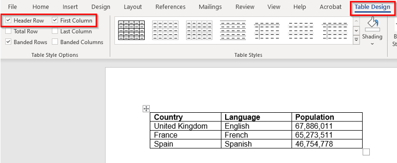
Tables
Tables in Word need to have a simple structure and give column header information. To work with a screen reader, Word tables must not contain split or merged cells, completely blank rows or columns, or nested tables. For screen reader users, it is also useful to add a short descriptive caption for each table under Table Properties > Alt Text.
Lists
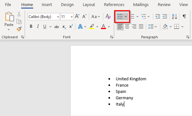
Using numbered or bulleted lists in documents can be a very useful way of breaking up complex, content-heavy information, making it easier to read and follow.
For people using a screen reader, the list itself can convey some valuable information including:
- where the list starts and finishes
- how many items are in the list
- what list item the user is on.
For the listing feature to work with screen-reading software, the author must create the list using the built-in list formatting within Word.
Images
Using images in a document can help convey complex information. The use of appropriate images can also often help readers with dyslexia and learning difficulties to follow meaning.
However, the placement of images on the page should be carefully considered. Images placed in a random way can interrupt the flow of the text and make it even harder to follow. Information producers should generally avoid fitting text around images. Rather, you should consider placing images at the end of paragraphs and allow sufficient space between the text and the image. You should also avoid placing text over any background image.
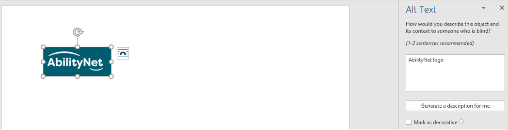
Not everyone reading your document will be able to see it. If a document is likely to be made available electronically, you must also consider adding ‘alternative text’ to your images via the 'Edit Alt Text' function which can be accessed by right-clicking on any image. Screen readers will subsequently convey the description that you have added as an alternative to the user being able to see it.
When writing your ‘alt text’, you should consider what the image conveys. This will help you decide how to describe it so that all of your document makes sense to everyone. You do not need to include words like 'image of' in your text alternative - screen readers will automatically announce that it is an image. 'Alt Text' should also ideally be kept short - about 150 characters at most. If the image additionally requires a longer description, then consider including this in the visible text of the document.
If the image is purely decorative you should mark it as such in the 'Alt Text' options so that screen readers are informed to ignore it.
Hyperlinks
For documents that are accessed electronically, including hyperlinks to web pages can enhance their usefulness for the reader.
Adding hyperlinks in Word is very easy through right-clicking on any word or group of words. However, it is important that the hyperlink makes sense as standalone information. It needs to convey clear and accurate information about what it links to – for example, by including the full title of the destination page. It can also be useful to provide the full URL in brackets after the descriptive link so that it is available if the document is printed of if users wish to cut and paste it.
Avoid restyling links to remove the underline, as this may make them difficult to distinguish as links for some users.
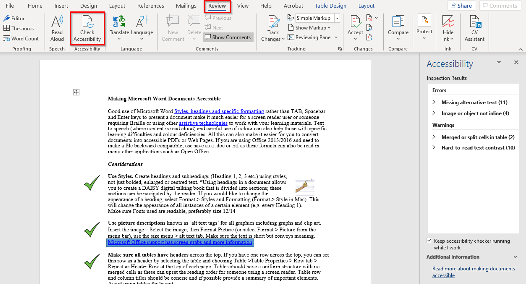
6. Use the Accessibility Checker
You can check the accessibility of your document in Word by using its built-in checker. The ‘Check Accessibility’ button is available under the ‘Review’ menu. This will highlight any accessibility-related problems with your document, describe why you should fix them, and give you guidance on how to do so.
You can also have the accessibility checker check your work while you are writing by checking the 'Keep accessibility checker running while I work' checkbox available under the checker.
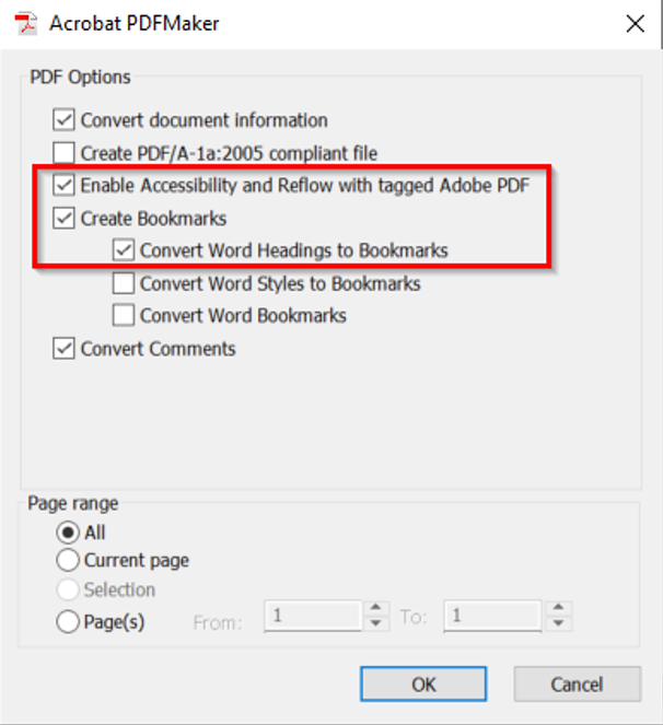
7. Converting to PDF
If you need to convert a Word document to a PDF, follow the instructions above to format headings, tables and lists with Word styles. Also, convert any embedded Office objects to images and add alternative text to all your images.
Ensure that the following options are selected in the PDF creation settings:
• Enable tagged PDF
• Create bookmarks using Word headings
Creating a tagged PDF is especially important for accessibility as it ensures that information about document structure such as headings, lists and alternative text will be available within the PDF document.
8. Useful resources
Office document accessibility
Microsoft provide extensive resources in different media on how to make your content accessible for all – in each of the Office 365 apps. These resources are free to access at Create accessible Office documents.
Writing alternative text
Benetech provides a useful free tutorial for writing alternative text - the Poet Training Tool.
PDF accessibility
If you need to know more about PDF accessibility, Adobe provides a range of resources on making PDFs accessible covering different versions of their PDF creation software.
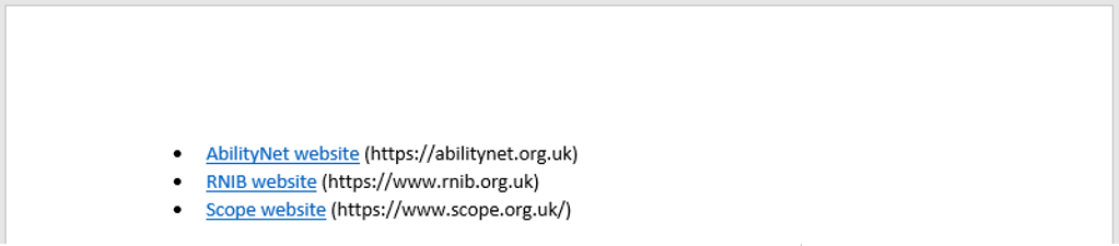
9. How AbilityNet can help you
My Computer My Way
My Computer My Way is an AbilityNet run website packed with articles explaining how to use the accessibility features built into your computer, tablet or smartphone. The site is routinely updated as new features and changes are made to the Windows, MacOS, iOS, Chrome OS and Android operating systems. The site is broken down into the following sections:
- Vision – computer adjustments to do with vision and colour
- Hearing – computer adjustments to do with hearing, communication and speech
- Motor – computer adjustments to do mobility, stamina and dexterity
- Cognitive – computer adjustments to do with attention, learning and memory
Use it for free at mcmw.abilitynet.org.uk
Advice and information
If you have any questions, please contact us at AbilityNet and we will do all we can to help.
- Call: 0300 180 0028
Please note: calls to our helpline number cost no more than a national rate call to an 01 or 02 number and count towards any inclusive minutes in the same way as 01 and 02 calls, and AbilityNet does not receive any money from these calls. - Email: enquiries@abilitynet.org.uk
IT support at Home
If you’re looking for in-person support, you can book a free visit from one of our disclosure-checked volunteers. Many of our volunteers are former IT professionals who give their time to help older people and people with disabilities to use technology to achieve their goals. Our friendly volunteers can help with most major computer systems, laptops, tablet devices and smartphones.
https://abilitynet.org.uk/at-home
Copyright information
This factsheet is licensed by AbilityNet under the Creative Commons Attribution-Non Commercial-ShareAlike 3.0 Unported License. View a copy of this license at creativecommons.org/licenses/by-nc-sa/3.0/
![]()